An Interview with Nuno Moreira
 by Amy Neftzger
October 1, 2013


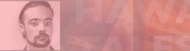
Nuno Moreira, an independent art director and photographer who specializes in book jackets and album covers, creates intriguing images and collages that evoke a sense of wonder and mystery. Born in 1982 in Lisbon, Portugal, Moreira currently resides in Tokyo, Japan and has traveled all over the world while working as an independent artist. He’s completed a number of solo exhibitions featuring his collage and photographic work. His most recent exhibition, State of Mind, presents a series of emotionally-driven black and white photographs from Moreira’s travels through various countries including Russia, Portugal, Japan, Spain, Hungary, Romania, South Korea, Ukraine, and Malyasia. The images in this exhibit capture life’s reflective moments, described by the Moreira as “brief experiences of being utterly suspended in time, beyond past and future.” These fleeting states of mind are both poignant and starkly beautiful.
Being mostly interested in his book designs, I spoke with Moreira about his process and approach to creating covers for literary works, including designs for publishers in the U.S., U.K., and Portugal, as well as redesigns for classic works such as A Picture of Dorian Gray.
The Fiddleback: You’ve traveled extensively. How has this influenced your book design?
Nuno Moreira: Traveling has definitely been my best school in life. I collect all kinds of books, postcards, stamps and weird paraphernalia by visiting as many bookstores, museums, and flea-markets as possible.
The curious and most important discovery about traveling or being away from the studio is that when I get back the way I approach work is much more direct and straight to the point. This is a big difference from some years ago when I would waste a lot of time just experimenting stuff without much sense of direction. With distance we can see things much better, so I strongly advice people in the creative areas to practice this method of getting away from what they need to do and do something else, go somewhere else.. Because their ideas will mature naturally, and I’m not saying to not think about a given topic, you should think about it, but just not in the same pressure environment or with the same people around you.
The Fiddleback: How long does it take you to create a book cover?
…what interests me in graphic design and visual communication in general [is] this idea that we as human beings are very finite but books and higher art will live on and keep on talking to future generations.
NM: It really depends since all projects tend to be very different from each other, which fortunately keeps me motivated and distant from having a daily routine. I might be sketching ideas for a book cover in the morning (since I like doing the creative things in the morning and more bureaucratic tasks like answering emails and invoices in the afternoon) while working sideways with some visual identity or music design. If ideas don’t flow easily it generally means I need more time to research and think about the project that I have in hands.
Designing book covers is really one of my favorite things, so I get very absorbed with new projects. Usually, within two weeks [from] first contact from the publisher or author, we have an idea, which then can be adjusted or finalized according with release schedules.
The Fiddleback: Can you briefly walk us through the process of how you design book covers?
NM: An important aspect about being an independent designer is offering flexibility and delivering fast results. The most common procedure is being initially contacted by email and being sent a manuscript or synopsis and sometimes some ideas or brief guidelines.
I start by reading part of the manuscript and taking very quick notes resembling mind-maps. I just write down keywords or phrases. From here, ideas arise on how to illustrate the cover so it’s just a matter of testing those ideas on paper or screen. I can generate 10-15 different ideas, but only send maximum of three to avoid confusing the client with different options. After choosing what best fits the book we just need to tweak and proof the file and prepare it for printing.
The Fiddleback: What catches your eye when you look at book covers created by other designers?
NM: I like being stunned and puzzled. I like intriguing images that make me think about the title and the image and which make my mind imagine things about what’s inside the book. This can be achieved in both simple and complex ways. I don’t like literal covers where the title says dog and you see a dog on the cover. My opinion is that the reader should be stimulated and not put off. As a reader and designer, I think of book covers as small art objects that I want to carry, hold, and be fascinated by. Reading is all about opening venues in your mind and making you walk in somebody else’s shoes, so I think covers should be addressed in the same way—as a pathway or trigger into something striking, bold, and which makes you want to know more.
The Fiddleback: Do you see differences in book covers across different cultures? Are there some universal themes in what appeals to readers/people in book design that spans some or all cultures?
NM: Trends aside, book covers definitely express a bit of the times we live [in] and the power of visual communication in a given moment in time. If we look back in history at designers like Alvin Lustig or Saul Bass, their designs are as alive today as they were in their own times. They’re still contemporary and beautiful. And this is what interests me in graphic design and visual communication in general, this idea that we as human beings are very finite but books and higher art will live on and keep on talking to future generations. This is a very inspiring thought and one that really drives me to look for a style of my own and start fresh everyday.
The Fiddleback: Do you have a personal favorite among all your book covers or one that is special to you for some reason?
NM: I’m very pleased with the cover for Leonard Cohen’s poem-book, God is Alive, Magic is Afoot, released by Galileo Publishers. It’s a simple cover but it combines all the evocative elements I work with: strong color variations, painted watercolor backgrounds, and a good sense of balance in both typography and readability. I think it turned out very subtle and iconic, plus it’s for Leonard Cohen, an artist I deeply admire and respect.
——
Nuno Moreira